Blend is a conceptual magazine with mix of relevant topics for the multifaceted woman presented in a visually entertaining way. #Conceptwork
Art Director + Design. Georgette Blay
The award is given each year to the top performing Rheem and Ruud Pro Partners. The design of the trophy was inspired by the core brand product design elements.
Creative Director. Todd Haislip
Art Director + Design. Georgette Blay
The visual infographic is a representation of the top movies over a span of 12 years (from my late teens to late 20s) that shaped and influenced part of my American identity.
A fun piece of creative work I’ve always loved. It was a project that wasn’t ever defined from the beginning but in the end showed how movies played a role in navigating a move to America as a child.
One of the Shoprite’s Well Everyday initiatives is an eight week in-store grocery thematic used to educate shoppers on the free in-store dietitian services. The visual style was inspired by magazine headline treatment and social gossip approach. Multi-channel tactics were layered together both in-store and online communicating to shoppers.
Creative Director. Todd Haislip
Art Director + Design. Georgette Blay
Copywriter. Bradley Jacobsen
Provide creative support for senior leadership of ADP National Account Services Division.
Building a better client experience. Architecting new tools and trainings to help JLL take project service to the next level.
Business challenge
As project and development services continued to see impressive growth year over year, developing a strong client experience was identified as a top priority ensuring greater consistency across project managers and a renewed focus to deliver the best for their client.
Solutions
Every element of reimagining the PDS client experience was based on a detailed approach including, stakeholder interviews, client interviews, competitive review and surveys with Project Managers.
We updated all the tools project managers use every single day: project management reports, meeting minutes and bid evaluation templates are a few.
We created a client experience training program to remind everyone what a strong client experience looks like and tips for delivering it.
We reimagined ways gather to gather client input from rewriting the client survey to creating an annual client relationship review template.
Results
The new tools were uploaded to the PDS Sharepoint site each file has been downloaded thousands of times.
The client experience training was delivered locally to 3,000 project managers.
Ongoing roll-out of the new tools and training included email announcements, presentations at leadership conference, presentations and updates on quarterly town hall meetings.
Developing an engaging work session
After reviewing critical information and conducting interviews the team put together a compelling and informative work session plan including a high-level review of insights gathered to date, a review of the journey map and a brainstorm of tools that will enhance the client experience.
Tools
A more detailed project process overview created transparency for clients.
Communications. Rolling out the program across the Americas.
The program was communicated to 3,000 employees over the course of 8 months after it was activated at the annual leadership conference.
An initiative start by Shoprite to inform shoppers on healthier eating options. At its core, the target goal of branding was always to provide a fun approachable way for shopper to learn better eating habits as well as showcasing the unique Shoprite stores adage of free in-store dietitian services.
Every eight weeks, a new initiative was revealed both in-store and online, providing engaging ways to eat healthier.
Creative Director. Todd Haislip
Art Director + Design. Georgette Blay
A chair representing the struggles of our past and the ability to forgive, support and help those who contributed to the struggle. Through forgiveness of each other can both be strong. The physical form of the chair shows two apposing forces coming together in harmony to create a strong base. The wicker represents the sense of vulnerability we must have to achieve forgiveness.
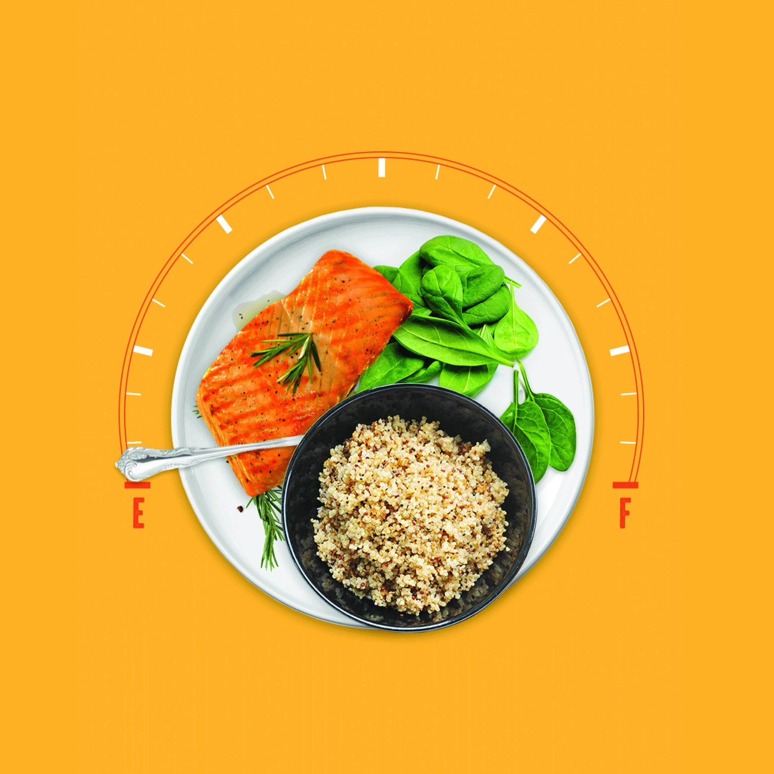
One of the Shoprite’s Well Everyday initiatives is an eight week in-store grocery thematic used to educate shoppers on energy rich foods in a playful, charismatic way. Multi-channel tactics were layered together both in-store and online.
Creative Director. Todd Haislip
Art Director + Design. Georgette Blay
Copywriter. Bradley Jacobsen
One of the Shoprite’s Well Everyday initiatives is an eight week in-store grocery thematic used to educate shoppers on eating a healthier balanced meal. Pulling visual inspiration from the concept of ying and yang. Multi-channel tactics were layered together both in-store and online.
Creative Director. Todd Haislip
Art Director + Designs. Georgette Blay
Copywriter. Scott Gurley
One of the Shoprite’s Well Everyday initiatives is an eight week in-store grocery thematic used to educate shoppers on great cooking substitutes, to provide delicious and healthy holiday dishes. Multi-channel tactics were layered together both in-store and online.
Creative Director. Todd Haislip
Art Director + Design. Georgette Blay
Copywriter. Bradley Jacobsen
A short story about a man on the brink of death, coming to terms with his life’s regrets and missed dreams never to be achieved.
The book is designed to show the fragility and unpredictably of life. The symbolism of a dandelion in bloom is used on the cover to show the hope and dreams most have for their lives, while the inside cover and through various spreads the other side of the dandelion is revealed to show the true reality of life; fragile, unpredictable and the revelation of death.
Kept hidden in the book’s folios is the main character’s emotional journey of regret transformed into forgiveness and finally peace with his impending death.
One of the Shoprite’s Well Everyday initiatives is an eight week in-store grocery thematic used to educate shoppers on smart snack foods that provide various needed nutrients in a clever and charismatic way. Multi-channel tactics were layered together both in-store and online.
Creative Director. Todd Haislip
Art Director + Design. Georgette Blay
Copywriter. Bradley Jacobsen
<meta name='impact-site-verification' value='d3f9f1df-f2b3-45e8-8c5b-cd42e888f6ee'>
I’ve always loved being in theater and performing. One of the main reasons being the ability to dress up in different characters. I’ve been some fun characters for halloween and always enjoy being inspired and making each costume.